Bar chart of column, unsorted

Bar chart of column, sorted

Project Metrics offers a selection of charts to choose from. You can find them in the Chart menu. The charts visualize the values currently on the grid. Most charts visualize the values of the currently selected column (current metric). Thus, before making a chart, put the cursor on the metric column you are interested in.
You can save the charts to a file. The available file formats are metafile (EMF and WMF), bitmap and GIF. Resize the picture to the desired size before pressing the Save button. You can also copy & paste them to your favorite word processor for your project documentation.
More charts? If you need the build other types of charts, you can copy & paste or export the data to your favorite spreadsheet program.
Bar chart of column, unsorted
Bar chart of column, sorted
Bar chart of column. This chart displays the selected metric column as a bar chart. Each value becomes a bar. The default is an unsorted chart. You may sort the column by clicking on the column header before taking the chart. In this case you get an illustrative view of the distribution of the values in size order. The green Median line illustrates the middle value. 50% of the values fall below this line and the rest is above. The red Outliers line displays the limit(s) of exceptional values.
Histogram of column

Histogram of column. This chart displays a bar chart of the frequencies of different value ranges. It's useful for getting a quick look at the distribution of values of the selected metric column. The more values fall in a range, the higher the bar. In the above chart you can see that a the typical length of a procedure name is 9–12 characters. Procedures with names longer than 13 characters are also quite common. Names shorter than 9 characters are few in this project. There is just one procedure with a 3-character name, and no 1-character or 2-character names. This is a sign of good design as very short names could be unintelligible.
Distribution of column

Distribution of column. This is an alternative to the histogram. Both illustrate the distribution of a single metric. This chart lets you see the area where most of the value reside. In addition, you get to see exceptional values. There is also a boxplot with outliers, median and Q1/Q3 values. Half of the values fall within the blue box, while the rest is out of the box. If some values can be considered outliers or extreme outliers, they are highlighted and the outlier limits are drawn in the chart. The violet curve on the left shows the relative distribution of values. The farther right the curve, the more values at that level.
Compare metrics
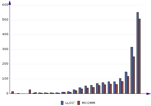
Compare metrics. This chart lets you compare 2 or more metrics to each other. Before getting this chart, you can sort by one of the metrics (click the appropriate column header) to display the bars in increasing or decreasing order. This chart is useful for comparing related metrics and finding dependencies. In the above chart you can see LLOC' (logical lines of comment) and MCOMM (meaningful comments) compared by file. You can see how most files have LLOC' and MCOMM at roughly similar levels, which is natural. There is a tendency, however, that MCOMM is a bit less than LLOC'. This means that not all comment lines are meaningful. They may be separator lines, empty comments and the like. Some of the least commented files, on the other hand, do have some meaningful comments even though there are no comment lines. This is due to end-of-line comments, which are counted in MCOMM but not LLOC'.
Compare histograms

Compare histograms. This is an alternative way to compare 2 or more metrics. In the above chart you can see PARAMS (number of procedure parameters) and VARSloc (number of local variables, excluding parameters) compared. As you can see, most procedures have 0 to 2 parameters. However, when it comes to local variables, nearly a half of the procedures have zero locals, telling us they are very simple.
Time chart
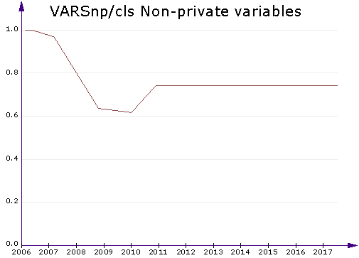
Time chart. This chart displays a line chart of 1 or more metrics by time. It works for the Project in time tab. You can select one to five metrics to plot. The time chart can be used to monitor historical development, such as quality changes or advances in project size. In the above example, you can see the average number of non-private variables in the classes of a project. (Non-private variables are bad. Classes should only have private variables and expose them through properties.) You can see that the average number of non-private variables went down from 2007 to 2010. Apparently the project was improved during this time. After that, this particular quality deteriorated. It might be a good idea to start a little improvement project next time the program is worked on.
Pie of limits on column

Pie of limits on column. If a limit applies to the selected metric column, you get a simple pie of the percentage of values within the acceptable range and outside of it.
Kiviat of limits on page

Kiviat of limits on page. This chart type displays the percentage of values within the acceptable range. It takes all the limits in effect on the current page. It is most useful when there are several limits on the metrics of the selected page. You get a quick view of which metric revealed the most problematic cases and which metrics didn't present any problems. In the above chart, the values on the outer circle are all right: no problematic cases were found with these metrics. The closer the value is to the center of the circle, the more potential problem cases were found.
XY chart of 2 metrics
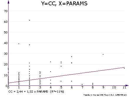
XY chart of 2 metrics. If you're interested in how any 2 metrics correlate with each other, this is your chart of choice. It's a simple scatter chart with one metric on the X axis and the other on the Y axis. If the metrics correlate linearly, you also get a line of correlation and an equation. Read more about regression analysis below.
The XY chart includes a simple linear regression analysis of 2 metrics (x and y). It tells how the y metric depends on the x metric, if there is a statistical dependency.
If x and y correlate (at 95% probability), a regression line is drawn and its equation is displayed at the bottom of the graph. If there is no statistically significant correlation (values are unrelated or number of data points is low), no equation and line is shown. Here is an example of the equation.
CC = -0.68 + 0.16 * LLOC (R2=76%)
This means that in this project, LLOC explained 76% of the variation of a procedure's cyclomatic complexity. CC increased by 0.16 for each line of code. In other words, complexity increases as procedure size increases. This is no surprise as CC is the amount of decision statements + 1, and the number of decision statements is likely to be higher in a large procedure. Notice that this is not a universal equation, the coefficients are likely to vary by coding style.
The R2 value tells how well the x value explains the variation of the y value. R2=100% means perfect correlation. You can get values close to 100% from metric pairs that are closely related, such as LINES and LLINES (physical and logical lines). A low value of R2 means that although the values may be related, there is no clear linear relationship. A good way to evaluate the fit is also to see how well the regression line fits the data points.
For another project, we tried the XY chart where x=PARAMS and y=LLOC' (parameters vs. comment lines). We found out that R2=3%. Thus, the number of parameters and the number of comment lines were not related. One would probably expect that the amount of commentation increased by the number of parameters because the use of each parameter should be commented. Thus, the use of parameters was not properly commented in this project. In fact, a half of the procedures were totally uncommented. Related, we also tried with x=CC and y=LLOC'. In this case, R2=39%. We were happy to find a good positive correlation between complexity and commentation. This was a good sign because even if full commentation was lacking, the more complex procedures were commented to a certain extent.
Select Correlation analysis in the Report menu to run a correlation and regression analysis on the data currently displayed in the grid.
This feature calculates the linear correlation coefficients (r) and regression line equations (y=a+bx) for each pair of the metric series.
Select the metrics to correlate before running correlation analysis. You can do this in the View combobox. A large number of selected metrics (such as <All>) leads to longer analysis times and a large correlation table, not very easy to read.
In the correlation table, r values are given if they are statistically significant (at the 95% probability level). A correlation value is omitted if it's not statistically significant (low correlation or small amount of data).
Regression equations and R2 values are given for each pair of metrics that are statistically correlated. Pay attention to the R2 value. Even though 2 metrics may be statistically correlated, the effect may be very low (a low R2). The regression equation is more meaningful when the R2 value is high.
Notice that a metric that is defined via another metric correlates with the other metric. This happens for a number of metric pairs. An example is IFIO=IFIN*IFOUT. IFIO correlates with IFIN and IFOUT because of its definition.
The more data you have, the better the correlation analysis. It's most useful on procedure-level data in a large project. If you have less than 10 lines of data (say project-level data), the results are probably not that interesting.
On this page you get a simple changes / day regression analysis. When you select DATE as the X metric, you can project the development another metric (such as LLOC) by time.
Example. The below results mean that in this project, the developers have historically written about 24 lines of code per day, and 5 lines of comments.
LLOC: 23.82 / day (R2=95%)
LLOC': 5.06 / day (R2=87%)
The equations show how your project has developed in time (assuming 7 days/week).
Use these historical time analyses with care. Especially, don't require your developers to write more code/day solely based on the above result. This is only a historical average. It depends a lot on what values DATE has. If you saved the metrics often during the test phase, for example, and less often during the coding phase, the test phase has got more weight in the analysis. The analysis gives equal weight to each DATE regardless of how many days passed. Thus, you get a more reliable average by saving metrics at fixed time intervals. What is more, LLOC is not a perfect way to measure programmer output, as it doesn't take changed or delete lines into account, nor bug fixing, meetings or planning efforts.
You might want to analyze historical project versions with the same version of Project Analyzer to make sure that no changes in different Project Analyzer versions affect the data.
You cannot do a correlation analysis on the All projects page. This page may display several versions of one project. In this kind of a setting, the data lines are strongly related to each other and the correlations would be exaggerated.